Final Degree Show, Friday 31st May 6-9pm, Markeaton Street Campus, Derby University....
Sophie Fenton's Textile Designs
Wednesday, May 29, 2013
Monday, May 27, 2013
Friday, May 24, 2013
Thursday, May 16, 2013
Statement of practice
Sophie Fenton
Specialism Print
Statement Of Practice
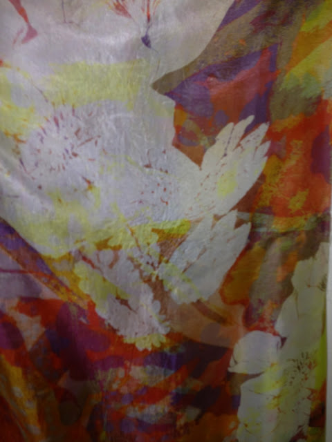
Floral Perspective
A Body of
work that has developed over the whole academic year, developing and changing
as it has proceeded, but still with a very clear outline and context.
Originating from the set Summer Project on British principles or distinctions,
British Gardens was one option that clearly stood out. The designs clearly went
in the direction of a floral nature and have held on to the organic connection
of flowers the whole way through.
Within the initial sketchbook, paintings and
drawings started to develop. Originally working with abstraction of flowers
using painterly effects and producing repeats of abstract shapes to create the
mirage of flowers but without any obvious representation. The designs
possibilities were clearly there and it gave an element of choice of
construction towards a culmination of potential options.
As the sketchbooks started to develop, Fine
Art started to become a strong point, the abstraction would be channelled in to
a different area and the images of flowers became detailed and structured. Developing
the designs to not be the obvious and traditional forms of floral repeats was a
main aim, keeping the designs fresh and with a one off kind of feel. All to
have the option of turning in to a classic repeat, but that only being for a
commercial option. Placement prints were to be more likely, giving that unique
floral effect, an essence rather than a constancy of flowers duplicated. The
ideas behind the paintings were to then be taken on to fabric.
A colour palette had to be determined, which
would be the main collection of colours, open to adding new colours but nothing
that would detract from the originality and also distract from the designs
working together as a series. The main colours to be used were Yellow, Magenta,
red, blue. All coming together to produce a light and summery tone, like the
effect of a full bloom of flowers on a summer’s day. Then adding Gold and
Bronze would give a little extra to what could be seen as just natural colours.
The metallic aspect adds a certain element of extra beauty and shine to the
fabric, maybe beyond what the background colours can do on their own and also really
defining key points within the design that will stand out and stand forward. Layering
colour physically on top of colour was the way the original paintings were
produced. The colours connecting on fabric would cause different results, as it
wasn’t just a case of waiting for the dye to dry. If u put one colour on top of
the other it would mix the same way that wet paint would. This would be
acceptable as to adding naturally to the sequence of colours but if it would
mix to a colour not wanted, this had to be thought through. So the ideal
situation would be the fix the colour and then go over the top with another.
Both situations would also create a depth to the design as well as natural
discolouration. This was a strong point to work with and partly added to the
layering of the designs.
Digital printing would be a strong part of the
prints on to fabric and also a way to experiment with different types of
materials. The choice of using digital prints was a way to develop the grounds
produced in the sketchbooks but was always going to be a vital part of the way
to take art on paper in to design on to fabric. Scanning images in and using CAD
to produce and develop new concepts in the prints, also a way of combining
parts of several the paintings to develop in to one and then the option would
be to take the digital designs on further. The choice of using several
different types of fabric was to experiment as much as possible with the hand
printing techniques and to learn what fibres will accept what type of dye or
process. Creating a strong affect within prints was a focal point and the
backgrounds were to develop as much as the foregrounds.
The Fabric choices would affect the overall
results. Using thicker fabrics would affect the colour and the drape and how
the design would look, but thinner fabrics would look delicate and probably
wouldn’t need much work on them. The digital prints were the way to produce the
ground and screen-printing was a way to build up the layers of organic looking
dots and dashes. It would be as if they were growing on to the fabric. But not
as within the paintings, using a screen was quite statutory. So mono printing
on to screens and also on to the fabric was a way to depict the same process.
But some structure would have to fall in to the prints, especially when
developing screens. There are limitations as to size and directions of which
you can use the screen. So the screen designs had to be adaptable to different
sizes of digital prints as much as the other way round. Knowledge of processes
best for the prints was something to be tested and exploited within producing
the designs. So testing and succeeding or failing was to in turn developing the
prints further. Happy accidents could also lead to success, but reproducing them
was always going to be difficult.
Using the
material Hazelwood, which has
polyester in it, limited the choices of processes but it also meant that using
disperse dyes and transfer printing would have a great affect, then also using
Devore to burn out patterns and flowers would leave the print with discovering
more layers. Silk Habotai and Silk Cotton could be seen as a choice
for delicacy, which in turn does not need many processes to expand on the
affect. Thicker Silk Cotton can be
used affectively to devore, which produces an attractive form of treading, but
thought has to be introduced to as to which way the cotton and silk are
threaded (the warp and the weft) as any vertical lines will tear and produce an
unattractive effect. Silk Viscose Velvet,
lends to the production of vibrant colour on the front, iridescent to the way
the fabric is looked at and it can also layer on the front and back, which can
produce a double-sided fabric but also develop transparency, texture and colour
combinations that truly electrify off each other. Pigment printing of all the
hand techniques is possibly frowned upon as a trivial and cumbersome, maybe a
little dated. But in the affects of layering pigment can produced a definite
affect. Choosing to use techniques that involve a layer very much on top of the
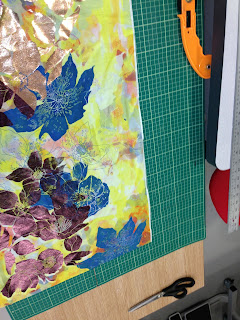
fabric, like flock and foil, makes an added texture, layer and affect within
colour of the whole print.
Printing on
a bespoke basis does not lend so well to interior manufacturing but does to one
off designs within fashion. The hand drawn element of flowers does in fact sway
towards the ideals of wallpaper, interior fabrics and even wrapping paper and
card designs. A fine line has to be balanced within designing for commercial
repeats, especially within costing. A digital design with many colours would
not be preferred for interiors; it is costly as well as a unique taste. Whereas
for Fashion, especially high-end designs. It could be more acceptable to have
unique and over the top designs and colours. So the difference in material and
price could be maintained to a healthier profit. Designing, as a student and a
career are two very different things but at this point, it is clear how to
develop ideas commercially as well as putting a cutting edge design in to
practice. The two could easily be developed hand in hand
Research Sources for Studio Practice
Alfrey, Nicholas & Livingstone, Marco (2002) Maurice Cockrill: Published by Merrell
Publishers Ltd.
Berger, John (1972) Ways of Seeing: Published by British
Broadcasting Association and Penguin Books.
Blackley, Lachlan (2006) Wallpaper: Published by Laurence King
Publishing Ltd.
Cole, Drusilla (2009) The Pattern Source Book, a century of
surface design: Published by Laurence King Publishing Ltd.
Cole, Drusilla (2007) Patterns: Published by Laurence King
Publishing Ltd.
Fearnly-Whittingstall, Jayne (2000) Peonies, The Imperial Flower: Seven
Dials, Cassel & Co.
Frazier, Nancy (2005) Georgia O’Keeffe: Published by World
Publications Group, Inc.
Gibson, Robin (1976) Flower Painting: Published by Phaidon
Press Ltd.
Goldsworthy, Andy (1990) Andy Goldsworthy, A Collaboration with
Nature: Published by Cameron Books.
Hallet, Clive and Johnston, Amanda (2010) Fabric For Fashion, The Swatch Book:
Published by Laurence King Publishing Ltd.
Hallet, Clive and Johnston, Amanda (2010) Fabric For Fashion, A comprehensive
guide to natural fibres: Published by Laurence King Publishing Ltd.
Hanaor, Cigalle (2006) The Cutting Edge Of Wallpaper:
Published by Black Dog Publishing.
House, John (1986) Monet, Nature in to Art: Published by Guild Publishing, London.
Isset, Ruth (2004) Colour on Cloth: Published by Batford, an imprint of Anova
Books Company Ltd.
Isset, Ruth (2007) Print Pattern and Colour: Published
by, Batsford, an imprint of Anova Books Company Ltd
Martin San, Macarena (2009) Patterns in Fashion: Published by
Evergreen GmbH, Koln.
Nesbitt, Judith (2010) Chris Ofili: Published by Tate
Publishing, a division of Tate Enterprises Ltd.
Nicol, Karen (2012) Embelished, new vintage: Published by
A&C Black Publishers.
Osers, Edwald (1988) Gustav Klimt, Landscapes: Published by
George Weidenfeld & Nicolson Ltd.
Scottish National Gallery of Modern Art (1995) Contemporary British Art in Print:
Published by The paragon Press.
The Reader’s Digest (2007) Reader’s Digest New Encyclopedia of
Garden Plants and Flowers: Published by The Reader’s Digest Association Ltd.
Thorne, Dawn (2009) Transparency in Textiles: Published by
Batsford, an imprint of Anova Books Company Ltd.
Quinn, Bradley (2009) Textile Designers, at the cutting
edge: Published by Published by Laurence King Publishing Ltd.
Wells, Kate (1997) Fabric Dyeing and Printing: Published
by Conran Octopus Ltd.
Exhibitions
Fashion and Textile Museum
Hartnell to Amies: Couture
by Royal appointment.
Tate Modern- Permanent Exhibitions
The Design Museum
Unexpected Pleasures: The
Art and Design of Contemporary Jewellery
The Royal Academy of Arts
Manet: Portraying Life
Victoria and Albert Museum
Ballgowns: British Glamour since 1950
Somerset House
Valentino: Masters of Couture
Paris Exhibitions and visits
The Pompidou Centre: Permanent
Exhibitions
The Louvre: Decorative Arts section
Premiere Vision (Selling Exhibition) Upcoming
and established Textile Design Companies, Colour Forecasts, Weave, Knits,
Indigo Prints, Digital and Hand techniques.
Magazines
Elle Decoration
Elle Magazine
Vogue Magazine
Draper’s Fashion Magazine
Selvedge Edge
The World of Interiors
Websites
Brewers (2013)
Wallpaper Direct [Online] http://www.wallpaperdirect.co.uk/?gclid=CKfWsMaCnbcCFdDJtAod2DQABQ
Accessed January-May
2013
Condé Nast Digital Ltd (2013) British Vogue
[Online] http://www.vogue.co.uk Accessed January-May 2013
Designers Guild Ltd (2013) Designers Guild
[Online] http://www.designersguild.com/fabric-and-wallpaper-showroom/wallpaper-and-wall-coverings/
Accessed January – May 2013
V&A (2013) Victoria
and Albert Museum Archives [Online] http://www.vam.ac.uk/content/articles/t/the-v-and-a-archive/
Accessed January-May
2013
WGSN (2013) WGSN
[Online] http://www.wgsn.com.ezproxy.derby.ac.uk/content/section/home.html Accessed January-May 2013
The National Gallery, Trafalgar Square, London
WC2N 5DN (2013) Claude Monet [Online] http://www.nationalgallery.org.uk/artists/claude-oscar-monet Accessed January-May 2013
Monday, May 13, 2013
Thursday, May 2, 2013
From foil to flock.......
Creating many layers worked well, Busy and colourful fabrics. Bold and attractive hopefully not too much. But I am treating them as much as a one off piece as a way to develop more simple designs for selling afterwards......?
Subscribe to:
Posts (Atom)


